
How Palette Obscura Started (or: Accidentally Live-Tweeting Żuławski)

My brain got suspended between my personal and professional lives one rainy afternoon as I tucked into a classic blanket/tea situation to watch Żuławski’s Possession.
(I did so sheepishly, because having been alive almost as long as the 1981 film itself, this was my first watch.)
Oops I professor’ed it
Having taught color theory in college and university settings for over 15 years at the time, I immediately recognized that this film was going to be steeped in intentional color. For self-amusement, I decided to tweet grainy snapshots of the TV screen with off-the-cuff observations as I watched.
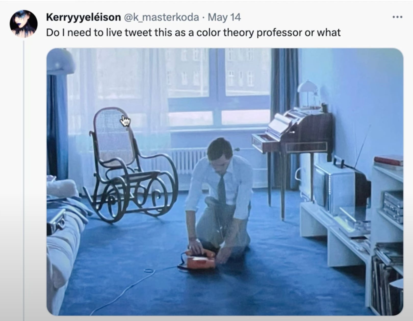
The thread didn’t go viral, but considering my small-fry status, it got enough engagement for me to notice that maybe not everyone’s brains dissect color palettes as they watch movies. Maybe some people actually enjoy watching a chamomile-infused professor spin a web of color conspiracy.
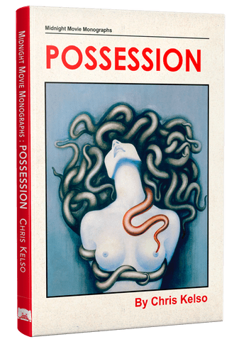
Aside from my own screenshot notes, my Possession tweets are long gone now (that platform… took a turn.) However, the talented Chris Kelso later invited me to contribute to his Possession installation of Midnight Movie Monographs (PS Publishing, UK) and my commentary lives on in some form. (Plug!)
In the few years since my tweetstorm, I’ve also revisited Possession in my color theory courses as part of a “color in film” unit. Each time, it reminds me of how fun it was to go completely off the rails with color analysis, not aiming to present a formal, professorial take, just to fart around with color insights (and perhaps some nonsense) based on a wealth of prior knowledge.
Why Palette Obscura exists
Fast-forward to now: Palette Obscura emerges from a place of… well, a little desperation.
Not desperation to monetize, (though, yes, I’ll be making some stuff with price tags), desperation to survive in *waves arms vaguely* all of this.
This orbiting mass of carbon is not currently an easy ride. When we aren’t trying to survive or trying to help other people survive, I believe that we should do things that are fun, connective, and deeply restful. We should do these things because that whole task of surviving and helping others survive requires recharging.
Art, both creating it and consuming it, is a survival tactic.
Art, audience, and connection
I’ve been surviving via art-making nearly my whole life, and as a practicing and exhibiting artist in 2D mixed-media and video, I’ve always shared my work publicly.
But here’s the thing: my work, MY work, is incredibly selfish in the best way. Any time I tried to market it or make it for an audience, things fell apart, because my personal art exists solely to help me process being alive.
Still, something has itched at me, especially now, when we need more connection than ever. I DO want to make something that intentionally connects with people.
I kept coming back to Possession, and the way my nerdy art background suddenly felt more approachable.
Building a bridge with cult cinema + design
Great films are a beautiful escape; they can surround us, get under our skin, and rewire our emotions. Horror and cult cinema? Especially from the 80s? That hits just right for me, because not only are the colors (and practicals!) epic, but also the balm of nostalgia shouldn’t be underestimated, not in times like this.
I’ve been obsessed with building color palettes since I was a teenager, filling little notebooks with curated magazine clippings and color chips that “just go.” As an adult, I’ve executed color schemes for my landlord to cut down rent, helped friends and family remodel, and helped businesses rebrand. It always felt like a sort of absent-minded side-dish of a skill, but maybe it’s part of the bridge between my private art and the kind of connection I’ve been craving.

Color analysis is fun, but I started thinking about what it would mean to live inside the films we love, and to bring those same atmospheres and palettes into the spaces where we rest, create, and recharge. Our environment impacts us, so why not craft a space that echoes our favorite stories and moods?
Welcome to Palette Obscura
So, here we are. Palette Obscura is my attempt to merge film color analysis, palette design, and art-making into something that is MEANT to be digestible, audience-driven, and take-home-friendly: a small survival snack for creator and consumer. And it all started with a rant about Sam Neill’s sweater color on a rainy afternoon.
If you made it this far, thank you!
Future posts will include color breakdowns of specific films (Videodrome on deck!), showing you how those colors can translate into real art and real life, and maybe some silliness about paint chips.
Subscribe if you want to hang out with a color theory professor overanalyzing cinema instead of grading.